Apple has long preached the gospel of minimalist design, and that's been a clever business strategy. But it's one that other companies would be foolish to follow closely.
The cleverest trick that Apple has ever pulled isn’t convincing us to pay $500 for a phone or MP3 player, but rather convincing the world that if you want good design, then you have to follow Apple’s template of clean lines and stripped-down details. You can see how that happened: The company has become so synonymous with both good design and minimalism that most people assume those two things are one and the same. They’re not: You can have good design that’s fanciful and wacky; likewise, you can have minimalist design that’s horrible.
The fact is, minimalism has been a business strategy for Apple--and maybe their most successful business strategy of all. While just-in-time manufacturing and a stand-alone retailing have earned it hundreds of billions in sales, minimalism built the brand that made their gadgets lust-worthy to begin with. Let’s dissect how that works.
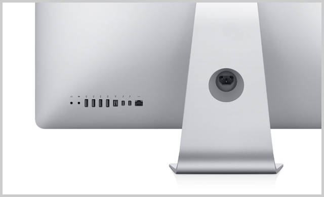
One of the best features of Apple’s gadgets hides in plain sight: Each one looks closely related to the others. The Apple TV interface isn’t too far different from that of iTunes; iTunes itself borrows the basic feel of the Apple OS. Meanwhile, the gadgets themselves take up that same sort of family feel: The iMac, MacBook Pro, MacBook Air, and iPhone are all radically different devices but they’re immediately recognizable as cousins thanks to their shared detailing and material palette.
To appreciate how unique that is, simply look at some of their competitors. While Microsoft’s new mobile OS is remarkably well designed, its design language has no relationship to the xBox UI, or the Windows OS. Not only do HP, Dell, Lenovo, and Samsung make boring black boxes, but every single black box they make seems to have no relationship with the others. As Apple has proved, that’s a massive missed opportunity. Each one of Apple’s gadgets quietly sells the others, every single day you have it. When you buy an iPhone, you’re buying into the Apple design language, and the little details you come to appreciate are details you know you’ll find in all their other products--from the laser-etched buttons to the stunningly beautiful screws to the dead-simple UI layout. When you finally decide to buy another Apple gadget--say, an iPad or a MacBook Air--you’ve already been primed to love it.
It would extremely hard to pull that off without a minimalist design language. The wilder your detailing and form-factor are, the harder they are to translate to totally different products. Not so with a minimalist palette--in that case, simply lifting a few, select details such as an aluminum case or a particular rounded corner, is enough to suggest a strong, familial relationship.
Brands are only as good as their last redesign: Almost every industry, from cars to computers to clothing, is littered with some cautionary tale about a run-away success that was replaced with a disaster. The goodwill that a company can build with a remarkably designed product can disappear overnight, if its successors don’t live up to expectations. Over time, and with greater and greater successes, the inherent risk that you carry with a redesign only grows.
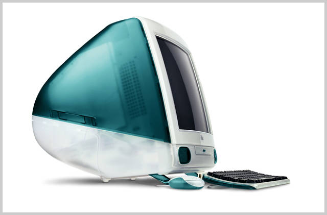
Thus, it’s no surprise that Apple’s own designs have grown more and more conservative over time as the company has evolved from a nearly dead also-ran into the world’s most valuable company. Take the iMac. The original design announced the company’s overhaul, and its boldness was a response to the enormous challenges that the company faced in 1997. The "sunflower" design that followed that was no less radical, with its swiveling flat-panel monitor. But since then, the iMac’s evolution has slowed. Today, it’s own design language moves in lock-step with Apple’s broader design language. Much of the same thing has happend with the iPod: The original, all-white design language has given way to a larger and larger screen--which means that the canvas for the rest of the design has grown successively smaller, so that these days, when you see a new design for the iPhone or the iPad, the redesigns are remarkable in how little actually changes.
The point is, by reducing the design language to such relatively small gestures--the curve of an edge or the etching on a button--Apple has reduced the risk associated with rolling out new products.
The growing screens and shrinking cases of our gadgets today mean that there’s actually very little to design in today’s products. I don’t mean that it’s easier to design these gadgets, but rather that the sheer footprint of the physical design has shrunk. Today’s CE designs aren’t much more than a glorified frame for a big black screen, and so the range of possible design gestures has become vanishingly thin.
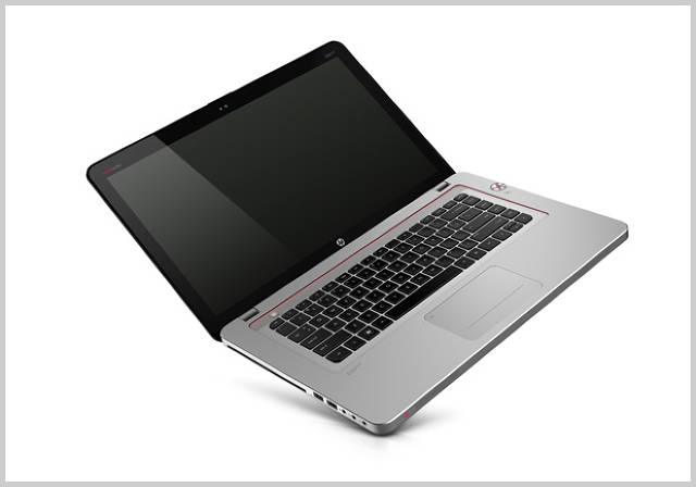
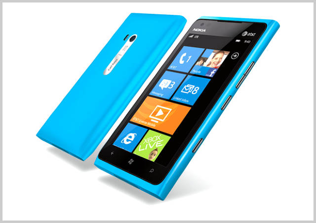
All of that plays directly into Apple’s hands, because it becomes harder and harder for other companies to distinguish themselves with less and less real estate open for redesign. If you’re simply designing a minimalist case for a laptop, and that laptop barely has more to it than a keyboard and a screen, then by default, almost anything you do is going to look like a copy of an Apple product. Phones are another good example: The actual case almost comes to nothing on today’s biggest phones. So even though the Nokia Lumia 900, for example, is a remarkable bit of industrial design, it’s impossible to imagine it as a breakout hit when its form factor is such a small part of its overall experience.
The Nokia Lumia 900: Well designed, but unlikely to break out.
Everything I’ve laid out above might seem like unalloyed praise for Apple. But that’s not my aim at all. I’m merely trying to point out that Apple’s minimalism isn’t just about aesthetics; rather, it’s a massively important piece of their overall business strategy. And as a result of their success, Apple has inseparable from most people’s definition of what "good design" means.
Is that a good thing? It’s not uncommon to hear people claim that Apple has singlehandedly improved the standard of design across myriad industries, simply by showing the massive profits that can result from better-designed products. That’s probably true. But I also believe that Apple might have reached a point where the company is actually bad for design, because their own example is limiting people’s imagination for what good design can truly be.
For one, it’s become almost impossible for anyone to design anything that isn’t in some way a response to Apple. Sometimes that’s good. For example Lytro, a start-up camera company, designed their product with the founding ideal of a dead-simple UI. That emphasis on simple, intuitive interactions is a legacy of Apple’s approach that should be followed forever. But more often than not, companies hoping to emulate the company’s success don’t realize that they simply can’t win by mirroring its current design strategy. They forget that before Apple became the world’s most valuable company, it bet the farm on the wildly weird iMac design.
But the broader problem with all this Apple adoration is that Apple isn’t dreaming nearly as big as it used to when it comes to design. I can think of one particularly huge gap in their imagination: The linkage between the pixels and the physical world. The design language you see on your iPad screen has very little to do with the physical design of the computer itself. While the case lives in a world of clean minimalism, the UI is filled with fussy, ridiculous details, such as the wood-paneled iBook store or the very iconography itself, which is beginning to feel dated and static. By contrast, I can see a day where the physical products are entwined with the beauty of the pixels inside--when every last physical detail evokes those within the UI, and vice versa.
It probably won’t happen soon, but eventually Apple will have to become an example not only of how you do things, but how much is left to be done. I’m eagerly waiting for it to happen.