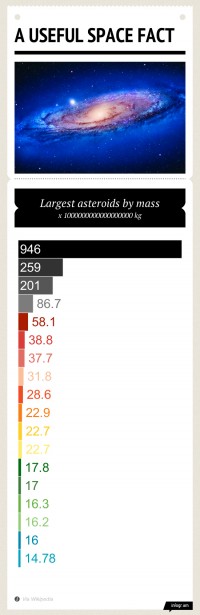
 Let's say you want to compare the airspeed velocity of various unladen swallows. You could put that data into a spreadsheet, or present it using a graph. Chances are you'll pick the latter.
The question is, how do you create a graph that not only looks nice, but presents said data in a coherent, easy to understand way? You could go the traditional route, and make something basic in Microsoft Office or your productivity suite of choice. Or, if you have a bit more skill, you could opt for the flexibility of Adobe Illustrator instead. But perhaps you have neither software nor skill, and just want to make a simple graph or chart.
Infogr.am takes the same approach that Tumblr took to blogging, by turning the otherwise daunting task of creating great infographics into a process that's dead-simple. You bring the raw data to Infogr.am, and the site's online tool can help you turn that data into a nice looking chart or full-blown infographic in minutes. It's really that simple—assuming you have a Facebook or Twitter account required to login—though, at times, to a fault.
The Infogr.am interface—inspired, no-doubt, by Apple's online iCloud portal—gives users the option of creating either a new chart or full-blown infographic, with five available templates to choose from at launch. A greyed-out store option suggests that more templates will be available for purchase at a later date (again, similar in approach to how Tumblr charges for premium themes).
Once you've selected a template, you get a basic editor wherein you can add pictures, text, and additional graphs, and swap each of these elements around into the order of your choosing with a quick drag-and-drop. Some are even animated. It's a good implementation of HTML5 web technologies, especially when compared with the more complicated user-interfaces of offerings such as Piktochart or easel.ly that still require some sense of design for anything more than basic customization.
That simplicity, of course, comes at a cost, and it's clear that seasoned design veterans won't be ditching their copies of Adobe Illustrator anytime soon. At the moment, the site offers just five stylized templates—and though incredibly nice to look at, don't give users very much in terms of customization just yet. In other words, you're currently beholden to the charts and styles dictated by each template, and you can't mix and match. Of course, the creation tool is still in beta, and fixing layout bugs and rendering quirks are likely of greater concern (one stubborn graph, for instance, refused to change its colors, while another element displayed un-stylized text).
A finished infographic gets assigned a unique URL, and you can choose to share that link through Twitter, Facebook or Pinterest, too. But there is a potential caveat; because Infogr.am designs are interactive, you can't embed a static image. You must either link back to the Infogr.am site, or embed the design using an iFrame. In scenarios where the latter isn't possible, embedding a functional infographic can prove challenging.
And yet, if you're the sort of person that's lacking in design sense, but have a story you want to tell, Infogr.am is shaping up to be one of the best tools available for simple infographic creation. It's nowhere close to the customization you'll get from Adobe Illustrator or Microsoft Office or even other web-based tools, but it is simple—and for the masses, that's key.