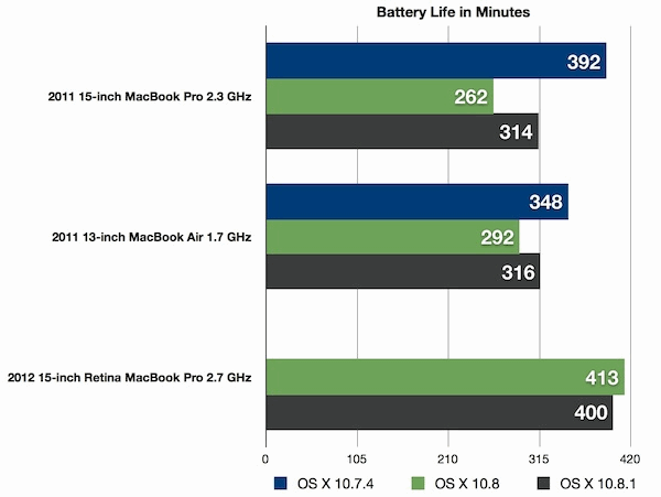
Battery life on portable Macs running Mountain Lion improved slightly with the OS X 10.8.1 update, but still generally underperforms the same Macs running Lion. Since updating to OS X 10.8.1 from 10.8, we have conducted several unscientific tests on a variety of different Macs and found there is a minor improvement to battery life between the two versions of Mountain Lion, though most users probably won’t notice a significant change.
The hardest hit Macs tend to be any portable model with a Core i5 and Core i7 CPU from 2011 and 2012, including the MacBook Pro and MacBook Air, while, interestingly, Core 2 Duo machines seem to be less impacted with battery performance remaining mostly the same in Mountain Lion as it was in Lion.
MacBook Air 13″ Core i7 (mid-2012)
OS X 10.8.1 – 4:36
OS X 10.8 – 4:33
MacBook Air 13″ Core i5 (mid-2012)
OS X 10.8.1 – 4:48
OS X 10.8 – 4:31
MacBook Air 11″ Core i5 (mid-2011)
OS X 10.8.1 – 3:26
OS X 10.8 – 3:32
MacBook Air 11″ Core 2 Duo (late-2010)
OS X 10.8.1 – 5:45
OS X 10.8 – 5:47
Not all Macs have been impacted negatively by Mountain Lion however, a MacBook Pro 2010 model reported no noticeable change in battery life regardless of the version of OS X running on it.
Again, these are unscientific tests, with each Mac was running at 70% brightness doing normal computing tasks like browsing the web through Automator. The numbers on the MacBook Air 2012 model are a particularly dramatic change from the 8+ hours we were able to achieve in testing with that machine running Lion some months ago.
If you’re unsatisified with the battery life of your Mac running OS X Mountain Lion, you can do a few things to increase it, including:
Watch Activity Monitor for errant processes and disk activity
Do less CPU intensive activity while on battery
Disable Bluetooth
Some users have reported mixed success with resetting their SMC (System Management Controller). Also, some early reports of battery life being lessened were due to the Spotlight mds indexing process running after the initial upgrade from Lion, and for those users simply waiting it out led them to resume to normal battery expectations. There are also suggestions that disabling iCloud helps, but iCloud integration is a significant reason many people updated to Mountain Lion to begin with.
The battery issue has been noted by other sites, most prominently with a large thread on Apple Discussions, and MacObserver also ran similar tests with similar results, though their Macs seemed to last considerably longer than ours in general as demonstrated by their chart below.
There is currently no mention of adjustments to power management or battery life in the first OS X 10.8.2 developer build, but that may change with future builds.
What is your experience with battery life in OS X Mountain Lion? Has it improved or gotten worse with the 10.8.1 update? Let us know in the comments.
Chrome: The combined powers of Syncpad for Simplenote and Syncpad Webnotes lets you place sticky notes directly on web pages that sync with all of your Chrome installations.
Syncpad for Simplenote - We've long espoused the virtues of Simplenote, and Syncpad gives you another convenient access point for all of your notes. One click on the extension's icon brings down a full list of notes, or you can create a new one. If you leave the extension to navigate on the page, it will always resume exactly where you left off, right down to the location of your cursor. You also get the option of opening the extension as its own tab, which places the list view and text editor side by side. Yes, it's simple, but that's the point.
Syncpad Webnotes - Syncpad Webnotes takes the Simplenote goodness one step further by allowing you to place sticky notes directly to any webpage. Each sticky note then generates a plain-text document with the note's text, URL, and location Simplenote, allowing your webnotes to be accessed on any Chrome installation with the extensions installed.
It occurred to me today that I’ve never blogged about the great work that David Gildeh and the Engineering team have been doing on Alfresco Cloud, which is a huge oversight on my part. The team launched several new features today, so that’s given me the nudge I needed. And if you haven’t tried it yet, maybe it will be the nudge you needed too.
I’ve been using Alfresco in the Cloud for some time now, both as a tester of the early offering and to do real work. For example, we’ve got an external firm working on the design of a new web site just for DevCon. It was a no-brainer to simply spin up a new Alfresco site to share documents with the external team via Alfresco in the Cloud. Much easier than it would be to get them access to our internal, on-premise Alfresco server. I think we’ll also create an Alfresco site for DevCon speakers and sponsors, to make it easier to share things like presentation templates, presentations, speaker bios, speaker headshots, sponsor collateral, etc.
In case you haven’t tried it, Alfresco in the Cloud is a multi-tenant SAAS offering of Alfresco Enterprise. Well, it isn’t exactly Alfresco Enterprise–there are a few differences. At the moment it is only about file sharing. You can add comments and ratings to a document and you can follow other users, but there aren’t other types of collaborative features that are available in the on-premise version. Still, if you’ve used Alfresco on-premise you’ll immediately recognize and be familiar with Alfresco in the Cloud.
A Few New Features Worth Mentioning
Today Alfresco released several new features that should motivate you to try it out. The first is the ability to publicly share any document. You just click the “Share” link and Alfresco generates a shortened URL. When your colleagues click the link you send them, they’ll go straight to the document preview with no login and no download required. That’s pretty cool. (One thing I’d like to see, though, would be a link to the full context so that if I have the rights I could then edit the metadata and so on, but that seems obvious, so I’m sure it is already on the list) (UPDATE: It’s in there, as David Caruana points out, see comments).
The next new feature is the addition of folders rules and actions. This is huge because (1) it is so useful and (2) it is a unique feature compared to what you’d see typically in consumer-grade cloud file sharing. In case you aren’t familiar, folder rules and actions make it possible to automate repetitive tasks as documents are added, updated, or deleted to/from a folder. In the Cloud, the actions are currently restricted to “Move”, “Copy”, and “Transform”. So, for example, suppose you want to transform all GIFs to PNGs as they arrive (similar for DOC to PDF and so on). A rule lets you do that. Or maybe you want to put everything that has “requirements” somewhere in the file name into a folder called “Requirements”. Rules are great for stuff like that.
For people who have upgraded from the free forever 10 GB account to a Cloud subscription, you can take advantage of another nice feature that was recently-added: WebDAV support. This means you can work with files that live in the cloud directly from Windows Explorer, Mac Finder, Office, or other tools that support WebDAV.
The final new feature is the addition of 256-bit AES encryption. It doesn’t provide much in the way of a sexy demo, but it is certainly a critical requirement to Enterprise users looking to store sensitive content in the repository.
The Beauty of Alfresco: One Platform, One API. What I think is really cool, though, is that the software we’re running in the Cloud is the same as what you can run on-premise (or on your own cloud infrastructure or on your developer laptop). So there is no mystery in how it works–it is all open source, after all. And it means that the lessons we learn about running Alfresco for thousands of users with tons of data make their way into Community Edition and Enterprise Edition.
But it gets better. Sometime later this year, as a developer, you’ll be able to write your own custom apps that persist content to Alfresco in the Cloud. That’s when it is going to get real interesting to me. Because at that point, you’ll be able to write apps that use Alfresco as a back-end, and it won’t matter whether you’re persisting against Cloud or on-premise (or both)–it is the same API (CMIS-based, I might add). And it won’t matter whether your users need to get to their content from a mobile device or from their browser (or both). Your app can run everywhere your users are and still use the same API to work with content.
I’m chomping at the bit to get my API key so I can play with this. I know several of you will be to.
Try It, You’ll Like It
Until then, you’ll just have to be patient and just enjoy Alfresco in the Cloud as an end-user. It is free to get started (sign-up). Partners get a free upgraded account, if I’m not mistaken, so if you are a partner and you don’t know about that already, ask your partner rep.
Alfresco’s Cloud API for Mobile Apps Now Available
PRWeb – Tue, Oct 2, 2012
Cloud Content Management Gives App Developers a True Enterprise Alternative to Dropbox, Box and iCloud
London, UK (PRWEB) October 02, 2012
Today Alfresco announced an open application-programming interface (API) for Alfresco in the cloud. The new cloud API is based on the most popular content management open standard, content management interoperability services (CMIS), pioneered by Alfresco and further developed by the Apache Chemistry project.
Alfresco’s new cloud API gives application developers who are creating business and productivity apps for iOS, Android or the cloud a true, enterprise alternative to consumer file-sharing APIs such as Dropbox, Box and iCloud. Later this year Alfresco will be releasing software development kits (SDKs) for iOS and Android to make it even easier for mobile developers to embed Alfresco capabilities within their applications.
The recently announced Alfresco Connector for Salesforce.com is the first enterprise cloud integration to use the new cloud API. Development teams for popular mobile applications such as Moprise and PDFPen for iPad and iPhone, in addition to cloud applications such as Filepicker, Otixo and Ephesoft have already started to adopt the new cloud Alfresco API.
“Consumerization of enterprise IT is creating a wave of web and mobile applications that rely on content interoperability across platforms such as Alfresco, Dropbox, Box and Google Drive. Building these applications with the right user experience and minimal engineering effort is a big challenge," said Anand Dass, co-founder and developer advocate at Filepicker.io. "By partnering with Alfresco, Filepicker.io solves this problem for enterprise developers of content-centric business applications. With Alfresco's new release, we can take the pain out of supporting disparate cloud storage APIs, unreliable file transfers, inaccurate content conversion and inconsistent hosting infrastructure.”
“At Smile Software, we are targeting business users and enterprises with our powerful mobile apps for document editing and annotation, PDFPen for iPad and iPhone. Alfresco’s new cloud API is a perfect fit for our target market because its cloud content service was designed for business users and is focused on productivity,“ said Philip Goward, founder of Smile Software.
“We are proud to be one of the first companies to embrace the new Alfresco cloud APIs making both Ephesoft Enterprise and Ephesoft Cloud compatible with Alfresco,” said Ike Kavas, CTO of Ephesoft, Inc. “With the help of Alfresco’s technical team, Ephesoft has certified the Alfresco cloud APIs to bring the best-of-breed cloud technologies together for everyone to enjoy."
Alfresco’s open source enterprise content management (ECM) platform has been downloaded more than three million times and is popular for enterprise developers who need to build content-centric business applications. With the addition of the new cloud API, Alfresco in the cloud now opens up much of that capability to a wider audience of mobile and cloud developers who need to access enterprise content for their apps.
“As a pioneer of open standards for content management, Alfresco understands what it takes to better service developers who are building robust, content-centric applications. With our new cloud API, we enable developers to build powerful content apps in the cloud and for mobile devices,” said Jeff Potts, chief community officer at Alfresco. “We plan to rapidly extend the Alfresco cloud API, based on constructive feedback from our community, to expose even greater capabilities of the Alfresco cloud content platform.”
Alfresco is demonstrating the new cloud API at JavaOne this week in San Francisco. With Alfresco, Java developers no longer have to worry about building a content repository for their apps, no matter if they are enterprise apps, cloud or mobile apps. Jeff Potts will share more during his “Building Content-Rich Java Apps in the Cloud or On-Premises with the Alfresco API” presentation at JavaOne on Tuesday, October 2 at 8:30am PDT in the Parc 55 hotel in room Powell I/II.
Additional Resources:
Developers can get started today and request an API key at alfresco.com/develop
Connect with Alfresco on Social Content, Twitter, Linkedin and Facebook
About Alfresco
Alfresco is how great businesses share, organize and protect content. Nearly seven million people in more than 180 countries use Alfresco Enterprise, Cloud, Mobile and Community to manage over three billion files worldwide.
Whether on the go or in the office, Alfresco empowers today's teams to do great work. Founded in 2005, Alfresco is headquartered in London with U.S. headquarters in Atlanta, Georgia. For more information about Alfresco, please visit: http://alfresco.com.
Fast Company's Austin Carr speaks with industry insiders and ex-Apple designers who have soured on the fake leather, glass, and wood that runs through OS X and iOS.
By now it’s almost inevitable given the company’s track record: No matter what Apple unveils tomorrow at the Yerba Buena Center (an iPad Mini? iPhone 5?), pundits will herald the company for its innovative thinking and bold hardware design. But the elephant in the room will be Apple’s software, which many inside the company believe has evolved for the worse in the last few years.
Despite consistently glowing reviews from critics and consumers alike, iOS and OS X, Apple’s operating systems which tie Macs and iPads and iPhones together, have rubbed some the wrong way in recent years with their design directions. During my reporting for Fast Company's feature on design at Microsoft, which was part of our October design issue, I spoke with a number of designers, Apple veterans, and industry insiders hostile towards Apple’s approach to software design. Equally eye opening was the number who genuinely praise Microsoft for its novel approach for Windows 8, the most radical redesign to date of the world’s most ubiquitous operating system. The criticism and controversy, much of it revolving around a trend called skeuomorphism, reveal chinks in Apple’s armor rarely visible to those outside One Infinite Loop.
What’s skeuomorphism? If you’ve ever used an Apple product, you’ve experienced digital skeuomorphic design: calendars with faux leather-stitching, bookshelves with wood veneers, fake glass and paper and brushed chrome. Skeuomorphism is a catch-all term for when objects retain ornamental elements of past, derivative iterations--elements that are no longer necessary to the current objects’ functions.
In software, skeuomorphism can be traced back to the visual metaphors designers created to translate on-screen applications before users were accustomed to interacting with computer software: virtual folders to store your documents, virtual Rolodexes to store contacts. But over time, skeuomorphism has seeped into all areas of UI design, especially in Apple’s software, where text documents, for example, are made to look like yellow legal pads.
"It’s visual masturbation," says one former senior UI designer at Apple who worked closely with Steve Jobs. "It’s like the designers are flexing their muscles to show you how good of a visual rendering they can do of a physical object. Who cares?"
Inside Apple, tension has brewed for years over the issue. Apple iOS SVP Scott Forstall is said to push for skeuomorphic design, while industrial designer Jony Ive and other Apple higher-ups are said to oppose the direction. "You could tell who did the product based on how much glitz was in the UI," says one source intimately familiar with Apple’s design process.
But before Forstall, it was Steve Jobs who encouraged the skeuomorphic approach, some say. "iCal’s leather-stitching was literally based on a texture in his Gulfstream jet," says the former senior UI designer. "There was lots of internal email among UI designers at Apple saying this was just embarrassing, just terrible."
Perhaps the most infamous culprit of this design direction is Apple’s Game Center, the social-gaming app that’s dressed in a lacquered wood and green felt that lends it the feel of a casino. "Steve pushed very hard to have everything--the felt-cloth table, the game chips--look like they would in real life," says another former Apple designer. "Internally, a lot of people were shocked by the richness. Many think it’s gone too far."
Some may wonder why designers would harbor such harsh feelings toward seemingly minor flourishes in UI design. But at Apple, where pixel-perfect standards are the norm, many designers believe skeuomorphism has significantly degraded the user experience.
The issue is two-fold: first, that traditional visual metaphors no longer translate to modern users; and second, that excessive digital imitation of real-world objects creates confusion among users. "I’ve come to absolutely dislike this trend in user interface toward skeuomorphism," says designer Yves Béhar, the founder of fuseproject, which is best known for designing the Jawbone and original One Laptop Per Child PC. "Using reality as a visual metaphor for the user interface rather than make the UI function on its own terms is something that has irked me for quite a while."
Béhar cites the example of Apple’s wooden digital bookshelves. "The digital bookshelf doesn’t really work like a bookshelf," he says. "You’re throwing all this extraneous visual noise at me and it’s confusing. My brain, which is used to the physical bookshelf, is confused because of the differences in usability. It’s cute, but not particularly useful."
In addition to being unhelpfully ostentatious, the visual metaphors are also outmoded in the eyes of many. Designer Gadi Amit, whose firm, NewDealDesign, designed the Lytro camera and Fitbit, points to the common use of the digital Rolodex to denote where contacts are stored. "I’m old enough, sure, but some of the guys in my office have never seen a Rolodex in real life," Amit says. "So these metaphors that were, in the early days of the computing revolution, relevant to assisting people in bridging the gap between the physical and digital worlds, are no longer necessary. Our culture has changed. We don’t need translation of the digital medium in mechanical real-life terms. It’s an old-fashioned paradigm."
Says the former senior UI designer at Apple, "I feel like [Apple] has concentrated too much on mimicking the visual skeuomorphic approach rather than concentrating on the actual functionality." For example, in iOS 6, the latest version of Apple’s mobile operating system, Forstall recently demoed an animated paper shredder, which will be used to delete e-tickets and coupons. How many iPhone users have ever actually seen a paper shredder in real life? Is it necessary? Or just visual masturbation? "To me, it’s lipstick on a pig," says the source intimately familiar with Apple’s design process. "There’s no need to add glitter if the product can stand on its own."
And even in the mobile world, where touch-screen smartphones and tablets are relativity new compared to the PC interfaces we’ve become accustomed to, the source believes we’ve moved beyond skeuomorphism. "Things have changed since the widespread use of iPhones and Androids," the source says. "Years ago, you’d need a manual to know how to use a smartphone. Those days are long over."
It’s important to note that not all visual metaphors are bad. Rather, it’s the excessive UI adornments of these visual metaphors that many insiders I’ve spoken with find distasteful and inherently confusing.
It’s also why many industry leaders are excited for Windows 8. For the design of its new operating system, Microsoft took a surprisingly refreshing approach, distancing itself from skeuomorphism while emphasizing a flat user interface that’s minimalist to the core. Sure, real-life visual metaphors still exist in the UI--an envelope to represent the mail app, a camera to denote the photo app--but the icons are without embellishments: no bevel, no 3-D flourishes, no glossiness and no drop shadow. It’s Microsoft’s stripped-down UI that many find appealing--a welcome alternative to Apple’s approach to software design.
In our feature story on Microsoft, you’ll learn how design is changing Redmond for the better. And you’ll also learn why designers from Gadi Amit to Yves Béhar to former Apple insiders are praising the company’s newfound design DNA. As Dan Kraemer, creative director of design firm IA Collaborative, told me of Microsoft’s and Apple’s software design, "These are two different approaches to creating great experiences, and I can’t necessarily say one is better than the other."
But many of Kraemer’s colleagues, as you’ll soon read in our feature story, are not as diplomatic when describing Apple’s approach to software design. Stay tuned.
[Image: Jose AS Reyes/Shutterstock]
The iPhone 5 is among us, the hype is over and the real comparisons with the Samsung Galaxy S3 can start.
Samsung Galaxy S3 vs iPhone 5
iPhone unveilings usually have a special, magical feel to them, but this feeling was missing earlier this month at the iPhone 5 event, and the flatness was worsened by the fact that Apple’s competitors have caught up with some amazing smartphones in the last 12 months. Apple had lots to say about the iPhone 5 and iOS 6, but it just seemed as if it was nothing special. Many analysts have said that the OS and the device itself lacked innovation.
A couple of weekends ago Samsung released an ad that compared the iPhone 5 to the Samsung Galaxy S3, and conveniently missed out anything that defended the iPhone 5. In the interests of objectivity, we’ll have a go as well.
The first thing you’ll notice about the iPhone 5 is how high-end it looks and feels – aluminum and glass, low weight and all that. However, there are many smartphones out that feel just as premium without the premium price tags.
Apple’s data sheets claim that the new A6 chip in the iPhone 5 is twice as fast as the A5 in the 4S. Many think that the chip is twice as fast because it’s integrated with Cortex A115 processors. There have been a few benchmark tests to back this up, and some have shown the iPhone 5 to be faster than the Samsung Galaxy S3 even. Others, however, show that the S3 with Jelly Bean is still faster than the iPhone 5 on iOS 6.
The iPhone 5 4” screen has a 1,136x640p resolution, which gives it a pixel density of 326ppi. The Samsung Galaxy S3 4.8” screen has a ppi of just 306 with its 1,280x720p resolution. The iPhone 5 isn’t any better than the Samsung Galaxy S3 here at all. Also, HD is becoming standard in Android smartphones – even the Nokia Lumia 920 has 1,280x768p, and a ppi of 332. This makes it bigger and better than the iPhone 5 in both size and ppi.
More battery life has been promised, and the data sheets say that the iPhone 5 will give up to eight hours on 3G and LTE, and 10 hours on Wi-Fi. This isn’t that great when compared to the Samsung Galaxy S3 which boasts longer battery life as well as a removable battery.
Storage wise, the iPhone 5 comes in three flavours, 16GB, 32GB and 64GB, but there’s still no external card slot. The smallest Samsung Galaxy S3, the 16GB, can support an microSD card of up to 64GB, making it 80GB total. This means that with a microSD card, the 64GB Samsung Galaxy S3 can take up to 128GB, twice as much as the most expensive iPhone 5 model you can buy.
So, the Samsung Galaxy S3 gives users the same – or even better – value for money and features as the iPhone 5. It is also cheaper than the iPhone 5, on or off contract. You can grab the iPhone 5 from 3rd party retailers like Amazon from as low as $149, and even T-Mobile ran a “no money down” sale last week to offer its Galaxy S3 for free on contract. If you missed it then there’s more to come. Next month Sprint is going to offer the S3 for $49.99 on contract as part of their Black Friday 2012 sale.
Price of course isn’t the real problem here. It is what the iPhone brand stands for. We can slate the iPhone 5 for not being as life-changing as we’d hoped, but we have to realise that the smartphone market has changed a lot since 2007. Apple could get away with a once-a-year release cycle as the competition was way behind. Now they’ve caught up, with rivals sending out innovative Android phones every few months.
Apple fans have still been queuing to pick the iPhone 5 up, though. Apple does need to remember that it has these fans because of the design and innovation of the past. The company has been stuck with the same looks for three years now, and isn’t pulling ahead of its rivals in the hardware stakes. Apple needs to step up and stop resting on its laurels. It needs to bring back that “magic” the original iPhone showed us and release a product that is revolutionary instead of just evolutionary.


